

Ghosts of the Desktop Era
Website Wisdom — Experience-driven Success Solutions
Our Brief 25-Year Web Era
Some things immediately say old to us, past, long gone, we don't do that anymore. Just as the older typewriters of the past clearly say so, have you thought that the desktop computers we currently use are almost in the same place - old relics?
We are whipping through the brief “web” era between the centuries of print and the future of voice search and voice commands. Maybe you thought the visual web was a destination and not a tunnel to the other side.
It has only been about 25 years. While musing on various recent client requests reminiscent of the desktop era in print, I found this small webpage that provides a sweet demonstration of our current short interlude in history: http://fabianburghardt.de/webolution/
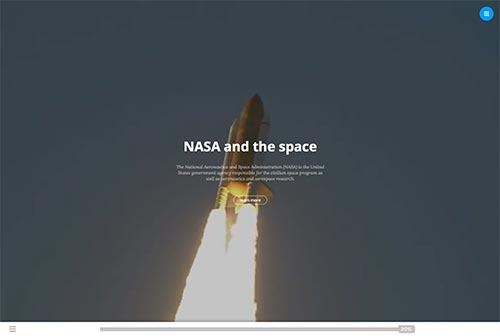
The opening screen shows a video of Project Apollo from NASA. What you may not notice is that there is a slider across the bottom. A button sits on the right edge with the year “2015.” If you slide it to the left edge it shows the year “1991.” What you see when you slide it is the same web page as if it was coded in 1991. Every couple years from 1991 to 2015, the page transforms to portray changes in the design style of webpages.
In 1995-1997 you can see the table grid used to create the page content. Text and images were fit into cells of a table. In 1999 we have audio calling the “10, 9, 8, 7, . . .” the numbers indicating lift-off, as we watch revolving images of space aliens. In 2003 we see the loading page opener, a technique no longer used. In 2005 we have a visitor count panel clicking away in the 3d grid box.
In 2007 the 3d navigation panel is present, and the “leather-bound” 3d background panel image revives a retro look in 2011. In 2013 we switch to vertical panels of solid colors. In 2014 we have image panes that rollup and down as background overlays with the outline box buttons. In 2015 we switch to video background, with panels of large photos below, curved outline link buttons, and a series of “material design” button panels. Can you find your most recent website design? How long has it been?
During this 25-year span we have gone from the initial introduction of the web through various stages of web design and coding that tried to duplicate the appearance of many features from the printed page.
This website is actually the landing screen for this web designer’s portfolio, and I thought it was really clever. If you are reading this on a smartphone, sorry, his page is designed only for desktop. It is, after all, portraying the desktop era.
The Page is Gone
The printed page, the web page, both are gone, their “era” is over. The person who named “Responsive” web design is Ethan Marcotte. In an article he wrote in 2010 he labeled the phenomenon of our web coding and design changes to accommodate the many new devices and web content styles. He observed an underlying strategy that became not just a way of doing web design, but the way, finding widespread adoption in just a few years.

“In fact, the idea of a ‘page,’ that wonderful word we borrowed from print, is increasingly irrelevant to our work. I'd argue that we're no longer building pages at all—instead, we need to think of our responsive designs as networks of small layout systems.’ —Ethan Marcotte, Responsive Design: Patterns and Principles, p. 3
These small layout systems are elements that can be rearranged to suit any size and shape of device. We have, in this way, abandoned page design for modular components. Our mental model needs to evolve to something much more fluid than the concept of a printed page, the idea we had copied for almost two decades.
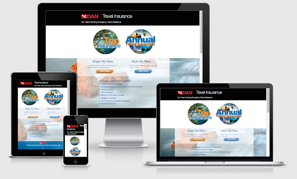
This website is www.DAN.ORG/travel. It is responsive. You see how the patterns of the shape and size of the main panels adapt to the different device styles.
With responsive design, we leave the print analogy behind entirely and create simpler pages that can show equally well on smartphones and other devices, with full size images and even videos.
The slope from desktop web design to “mobile-friendly” or, using its real name, “responsive” web design, is not a slippery one at all. It is filled with lumps and bumps in the road. Daily jolts come from the requests I receive from clients to preserve remnants of their printed pages.
How many times a day have you said “webpage”?
Stepping into the New World
We are at the end of an era. As we see the numbers of people purchasing desktop computers dropping, the smartphone numbers exploding, we have made the transition to a new way of life.
This new understanding of websites as modular systems that can rearrange their content for any size of display with fluidity stands in stark contrast to the static printed page.
The first printing press was invented about 1440. Five hundred and fifty years or so later this web phenomenon emerges. 25 years of web era seems like an instant by comparison. And now we have transcended into the voice era.
We are now fighting the reduction of our word content as we move grudgingly from the 22inch monitor filled with columns of text, to the 2inch screen on our phone.
And what about oddities like the Google Glass? That caused quite a stir. As a total “Trekkie,” I celebrated the moment I had the chance to try “Glass™” the first time, laughing the words “Beam me up, Scotty” to those around me. The screens on these things appear maybe 3 by 5 inches horizontally and hold about five lines of text. Personally, I think the people who manage business and advertising just could not imagine giving up all that screen space.
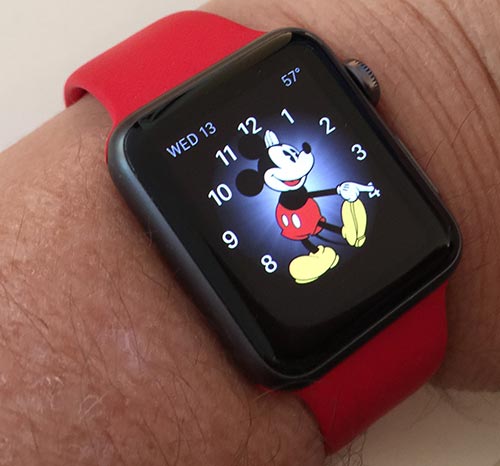
When I bought my “iWatch™,” the concerns spoken all around me were about how few words would fit on that screen. I bought the tiny one. When you can enjoy a dancing “Mickey™”, who cares about words? It is about the way the watch makes me feel. Life is fun. We are really speeding into a different era, I say, as I receive daily brief phone calls and text messages on my wristwatch.
The world of voice, GPS, and other features yet to be imagined awaits. Google is trying to understand not only the words but also the meanings of the phrases spoken or typed. I’m with Ethan on the need to move from “pages” of words to any size screen. Let’s go. But I will share the ghosts of the “desktop era” here with you as we go.
Here are some Tips for Choosing a Website Template