

Worried About Making Your Website Responsive
(for Tablets & Phones)?
Here are a few simple steps to guide your thinking about this recent switch to tablets and phones. Do you need to change your website? What do you do first?
Step 1 — Find Out How Your Web Visitors Reach You
If you have attached Google Analytics to your website, then go to your analytics results and check about devices. Select Audiences > Select Mobile > Select Devices. You can see how many visitors are coming to you from a device such as a phone or tablet. If you don't have Google analytics set up, then that would be your first step. Go to Google.com and add analytics first.
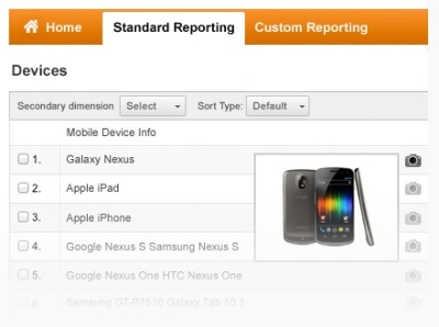
There are five choices to see here:
- Mobile Device Info: which devices
- Mobile Device Branding: brand names
- Service Provider: which internet provider
- Mobile Input Selector: touchscreen or other - this can be interesting
- Operating System: IOS versus Android
- Other: select . . . screen resolution
Select "Other: screen resolution"
Then you see the exact dimensions of the screens for every visitor.
Calculate what percent of your visitors are coming on phones and tablets from this information.
When you start to hit some high percentages here, then you know it is time to honor these visitrs with a good view of your content.
Step 2 — Understanding What a "Responsive" Website Is
A responsive site responds to the type of screen or device the visitor is using. It also responds to the differing intentions a viewer may have based on the device and setting used. The style codes on this screen resolution analytics page are set for device measurements such as 230 or 480 or 700. These dimensions are in pixels but roughly you can figure 230pixels is a normal phone screen 2 inches or so wide. 500pixels is like the long view on an iphone or the narrow view on a 7"inch tablet. 800 pixels and up is a larger device like an iPad.
For a smaller device you may see one column at a time instead of three columns side by side. The content in the second column might play below the first one. Third column goes below that. Various combinations may be used. For a 7inch tablet, you might see two columns at once. When a website is scaled down like this you see different views, and content in a different order, but you see the same basic content. It is not like a mobile phone site which offers reduced content or options.
Step 3 — Planning for Your Website
The first thing to think about is what your website would look like if it were only one column wide, one two-inch column. Here are some of the changes to imagine.
Photos: Those big photos on your desktop site will need to go. They may be able to reduce to five inches or so for a tablet site. You might have one or two photos that are narrow for a phone sized site.
Text: Cut out all the excess. Then cut more. If you have a long article you might use the first couple sentences and allow people to click to see more. To play a list of selections for choosing what to read, you might show a list of titles with little or no text.
Navigation: If you have a long navigation - five columns with dropdowns - that would become so long people are not likely to wade through them. Often people will put a button to click before seeing the navigation choices, or gather groups of topics into just a few choices.
These are some of the decisions you would need to make. If you think about the circumstances under which most people would view the site, then you can logically figure out what they might look at or read. Part of the thinking behind mobile phone sites or apps is that people want less information and you pick the few things they need. One of the drawbacks of this approach is that most of the time anybody choosing what others will need has been wrong.
The statistics here are quite funny actually. No one seems to get it right and people just take the bottom of first page click to go to the full site most of the time. Literally, this is true. I watched a site last year have almost 100% of its mobile visitors take the first page click to the full site instead. This is sad for someone who spent the money to make an elaborate mobile site and not have it used. Wise and detailed thinking is needed so you can stage your information appropriately and not miss your viewers by making the wrong content cuts.
Step 4 — Think About Your Options for Switching Your Template
Many people with content management system websites can select from a variety of templates available and simply switch to another one that offers responsive options. There are many for Word-Press already. Most content systems have choices available at this point. But there is one key drawback to a responsive template: it may have automatic ways to change the site that do not take into account your special content features or your audience needs. This is not a one-size fits all kind of change.
For example, one major chain store made the switch and their fifty menu items turned into five screens deep for visitors to find their item. This was most unsuccessful and they had to place navigation items quite differently on their second try. Deciding how to be kind to your visitors is not a simple process. Using an automatic template to do this is not always successful. A cheap choice may not serve you at all.
You may wish to interview professionals to help you. We can either do it for you, or we can look at the type of content you have and simply guide you to options that are better choices for you. We can guide you to the best ways to serve your type of clients and provide what they need. You can also pay for such guidance as a consultative visit. Do this before you hire someone else to do it all for you, so you know which skills to look for in your hired professional.
Responsive is just not a one-size-fits-all solution. (pun intentended)