
Peppergraphics Website Design and Search Engine Optimization, Chapel Hill, NC
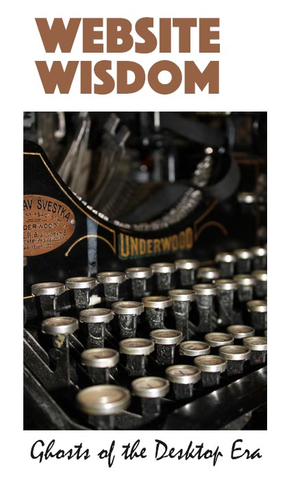
Ghosts of the Desktop Era
Website Wisdom — Experience-driven Success Solutions
Our Brief 25-Year Web Era
Some things immediately say old to us, past, long gone, we don't do that anymore. Just as the older typewriters of the past clearly say so, have you thought that the desktop computers we currently use are almost in the same place - old relics? We are whipping through the brief “web” era between the centuries of print and the future of voice search and voice commands. Maybe you thought the visual web was a destination and not a tunnel to the other side.

Tips for Choosing a Website Template
Website Wisdom — Experience-driven Success Solutions
Tip 1. Do not select a template based on the homepage desktop view.
Do people usually enter your website from the front door, the homepage? How do you know?
If you already have a website template, perhaps you selected it based on the desktop view of the homepage. Many people do. The thing you need to carefully review is the percentage of people who actually come to your website this way.
The majority may come through other doorways and you want to check out these other views. You want every doorway to be enticing, welcoming, and successful with your viewers.
Where is the flaw here? You love your homepage. After designing and developing more than fifty websites, I can say that almost everyone made their decisions based on the homepage appearance. The Front Door is simply the most important to website owners.
Is Your Website a Secret Island?

An Oceanic Journey — the Spread of Your Influence
“If we visualize the Web as a sea, then the technology is ships and the websites are islands.”
“The early days of the Web were the age of sail when the technology we had was fairly inert and websites were static concerns that put all their energy just into being.”
The Secret to Making Your Business Successful Online

How do you go from being a great baker and shopkeeper to making a great and growing business online?
In your shop the bread and pastries you baked were very popular. Your customers loved them. You loved your customers, too. When the people you knew came in to pick up their pastries, you enjoyed talking with them. They respected you. They trusted you. They told their friends about you.
You also knew what they wanted. You learned when they wanted bread and when they wanted desserts. You knew what they most enjoyed for breakfast pastry and you listened when they told you about their needs and interests. That was the key to your success. You listened. They trusted you. And you made exactly what they wanted. But, it was time to grow a larger business. Can you do the same thing online?
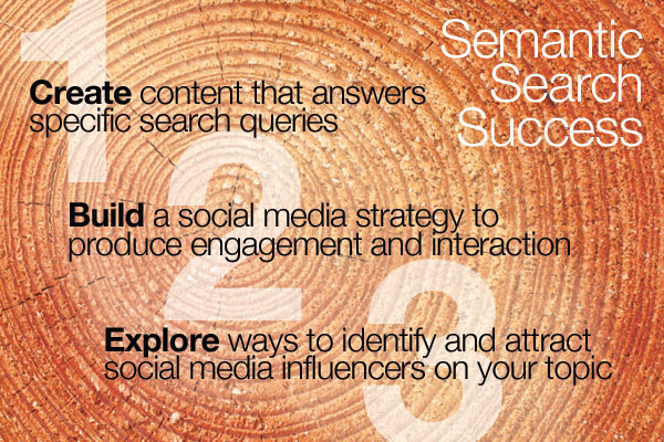
Social Media for Semantic Search Success
"Website content that cannot be readily and willingly created, shared, commented on, and reshared by real people, is, in Google's eyes, of scant real value and eventually will have no place on the search results pages."— David Amerland, Google Semantic Search
The expectation is that, if Google has understood your query correctly, and positioned high quality answers on the search page for you to find, you will find answers and your search will be satisfied. Then you need no longer search; the task is done. But with all the noise online, like going into a room where everyone is talking loudly, this is extremely complex. The search engine needs to understand the meaning of the words in the query and the meaning of the words in the web post in order to match them accurately. How does Google understand and identify valuable content on the web? How do you plan your website to fulfill the needs for high ranking?
Why Would Google Recommend You?
Have you ever gotten a request for a recommendation? So often you don’t really know the person well at all, and if you agree to help them, there you are trying to figure out something to say. It doesn’t work. It’s not genuine. Why would it be different for Google?
Did you ever recommend a store without trying its products? Well maybe, if a good friend you trusted suggested it. Is there any time that we recommend something in good faith that we know nothing about? Not really.
Doesn’t Google need to know something about you or your website content so it can rank it on a search page? Have you thought about this — that each site showing on the page is actually a recommendation? Each time you type in a search box, this is a request to Google for a recommendation of content that will be a solution for your need. Why would Google do this without knowing you and your content?
You are an ENTITY not a KEYWORD
Last year your business was just a keyword to the search engine.
This year you are an "entity". You have stepped up in the world. This is in the mind of Google Search. Last year search processed keywords and matching keywords tended to identify the search page where you or your business website would be found.
This was a big deal and people in the search engine business would work very hard to see that you placed in all the right pages for your keywords. Keywords were king! Not so anymore. In the summer of 2013 the Google search engine was replaced with a new one called "Hummingbird". This was not a superficial change as they have done many times in the past with updates. This was a profound change in the way the search engine thinks.
The Hummingbird engine understands word meanings, semantics, and now processes people, places and things as "entities" with relationships. This comes closer to the real thinking computers of science fiction in our minds. It can process relationships between entities as well as qualities of an entity. Learn how this affects your business now!